Client
Learning Ladle is a meal kit service for college students. The service aims to make cooking accessible and fun for a new generation of home cooks who want to learn how to make healthy and satisfying meals. Learning Ladle offers meal options suitable for dormitory-sized storage systems and full-sized meal options for students with access to full kitchens and larger storage systems.
Brief
We were tasked with a two-phase project in order to bring Learning Ladle to life.- Phase 1
consisted of developing the brand’s voice, and researching to effectively position Learning Ladle so that it stands out from its competitors in the industry.
- Phase 2 involved the creation of brand assets, mockups, examples, and the creation of the final brand book.
Creative Direction: Patrick Brennan, Gisselle Ramirez, Sunook Park
Art Direction: Patrick Brennan, Gisselle Ramirez
Copywriting: Patrick Brennan, Gisselle Ramirez
Signature
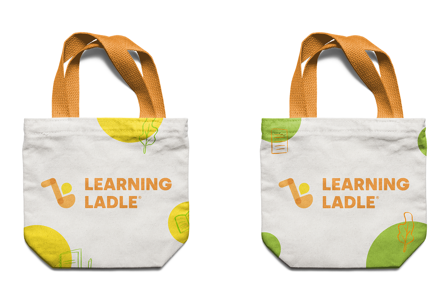
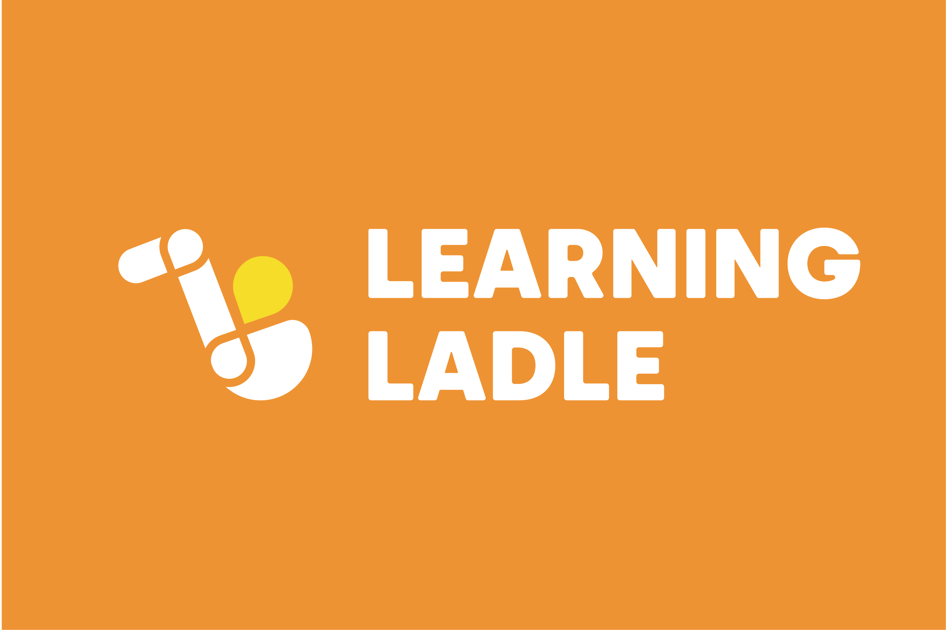
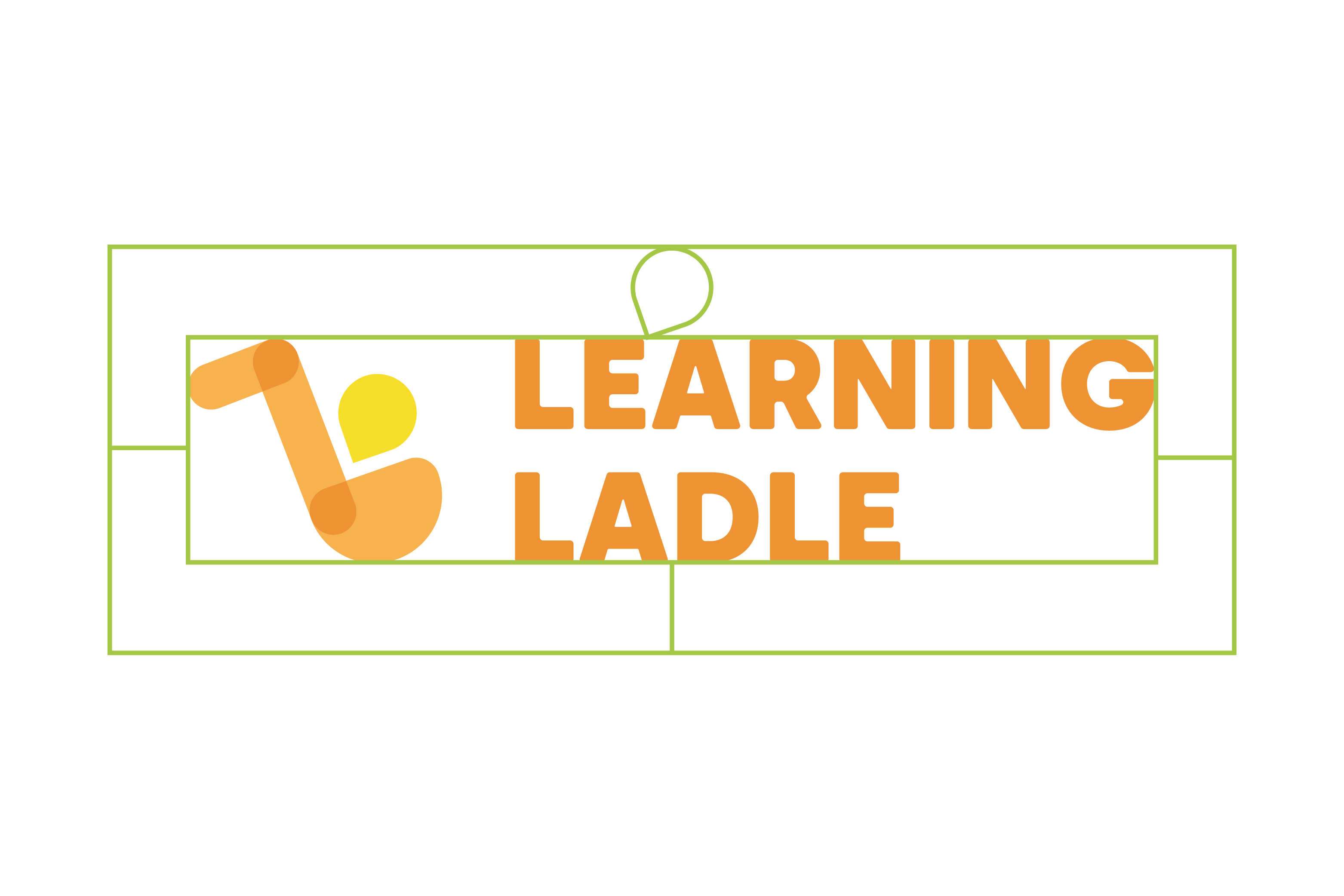
The Learning Ladle logo uses their namesake cooking utensil, a ladle. It is designed to appear through overlapping, transparent shapes. We created a custom, heavy-weight sans serif typeface and with rounded corners that felt friendly, approachable, modern, and substantial. Through this typeface, we hope to imply to our customers that they are getting a lot of good food for their money.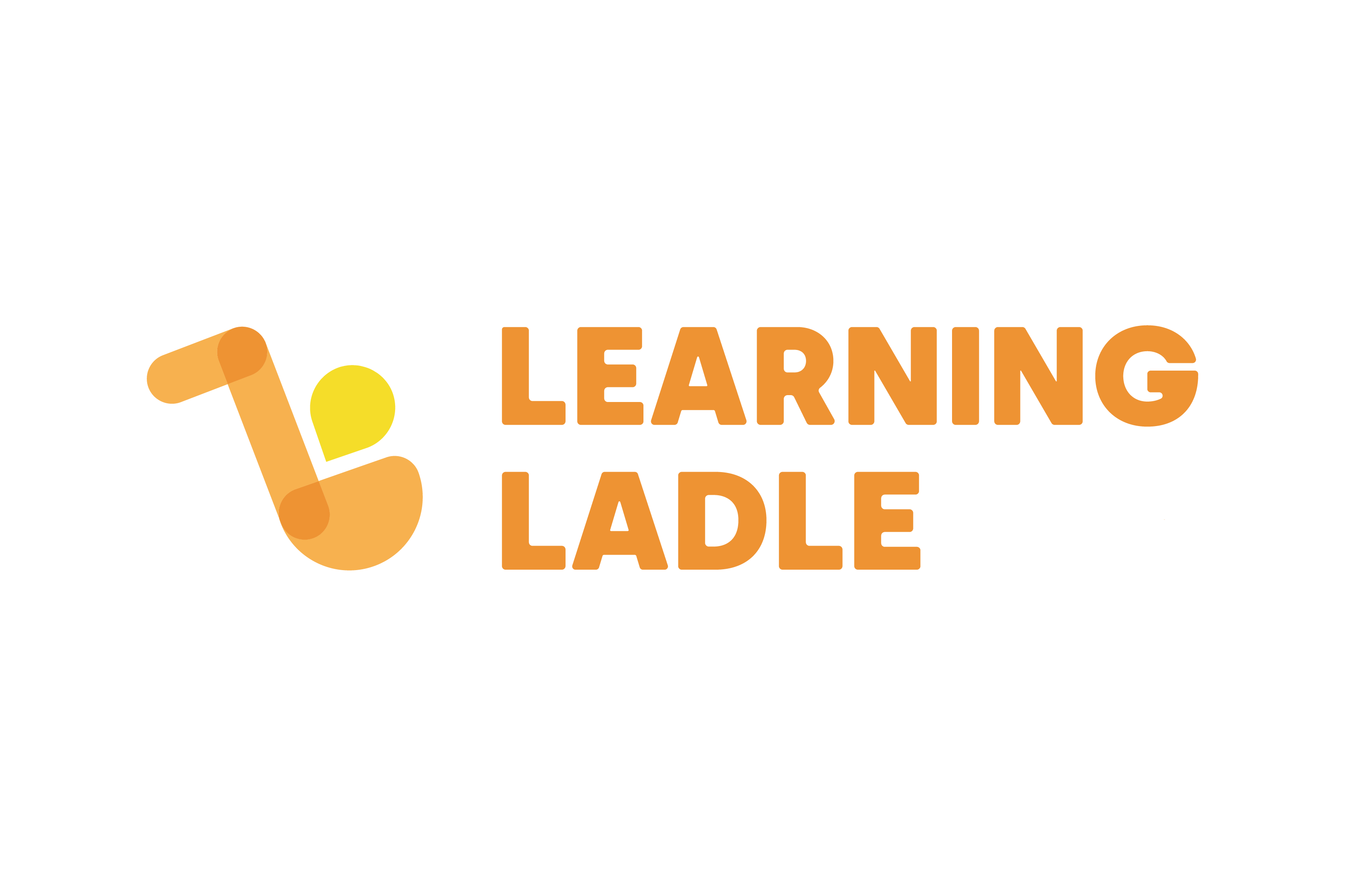


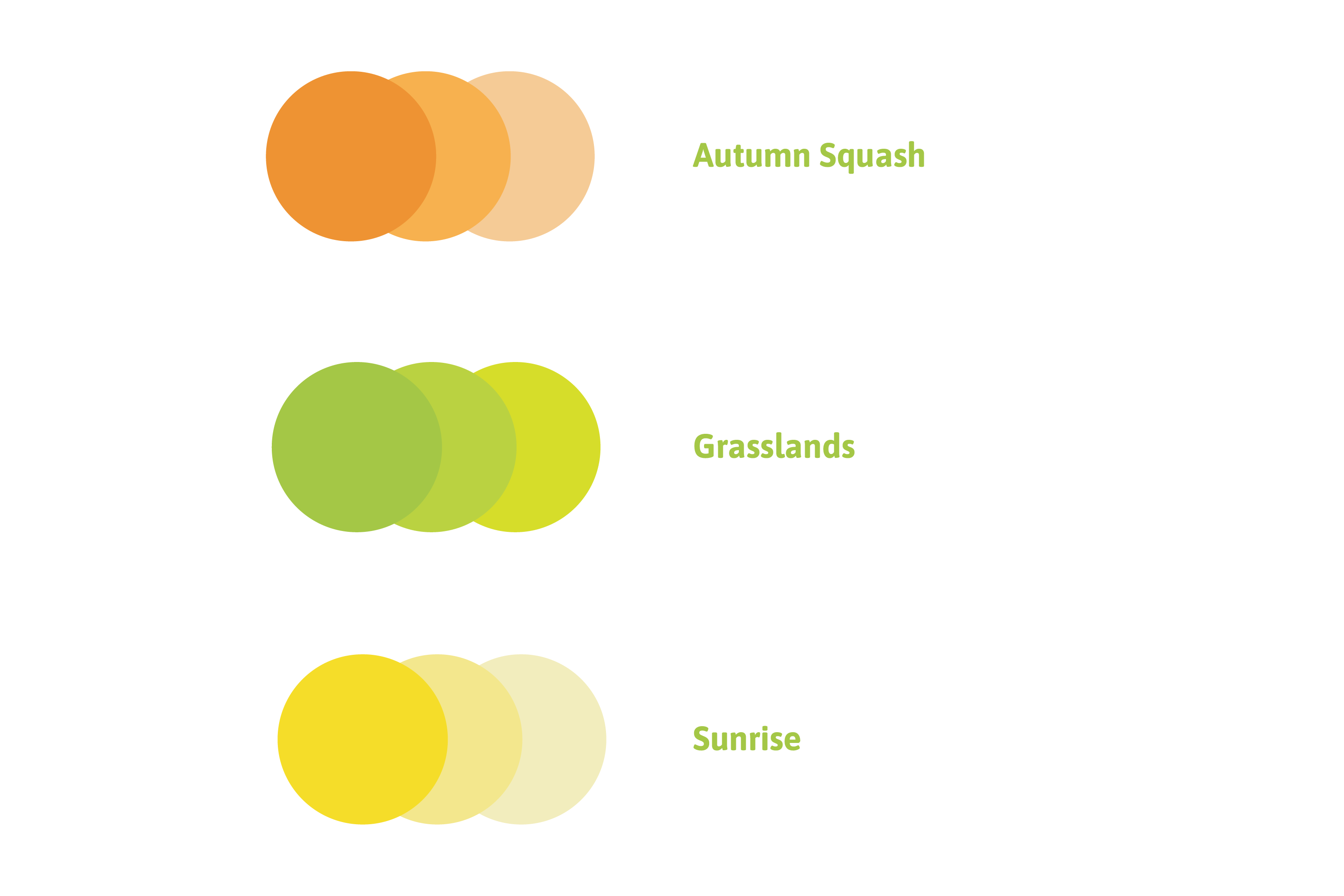
Colors
The Learning Ladle color palette is inspired by the company’s commitment to nutritious ingredients and affordability. It reflects the energizing effect of their meals and the growing intellect of the students they serve as they learn how to cook.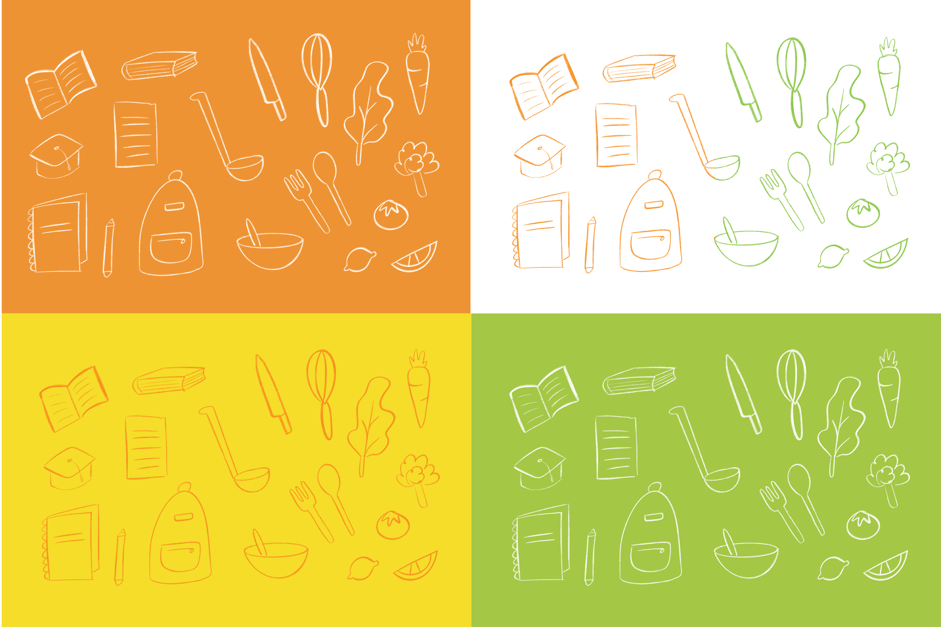
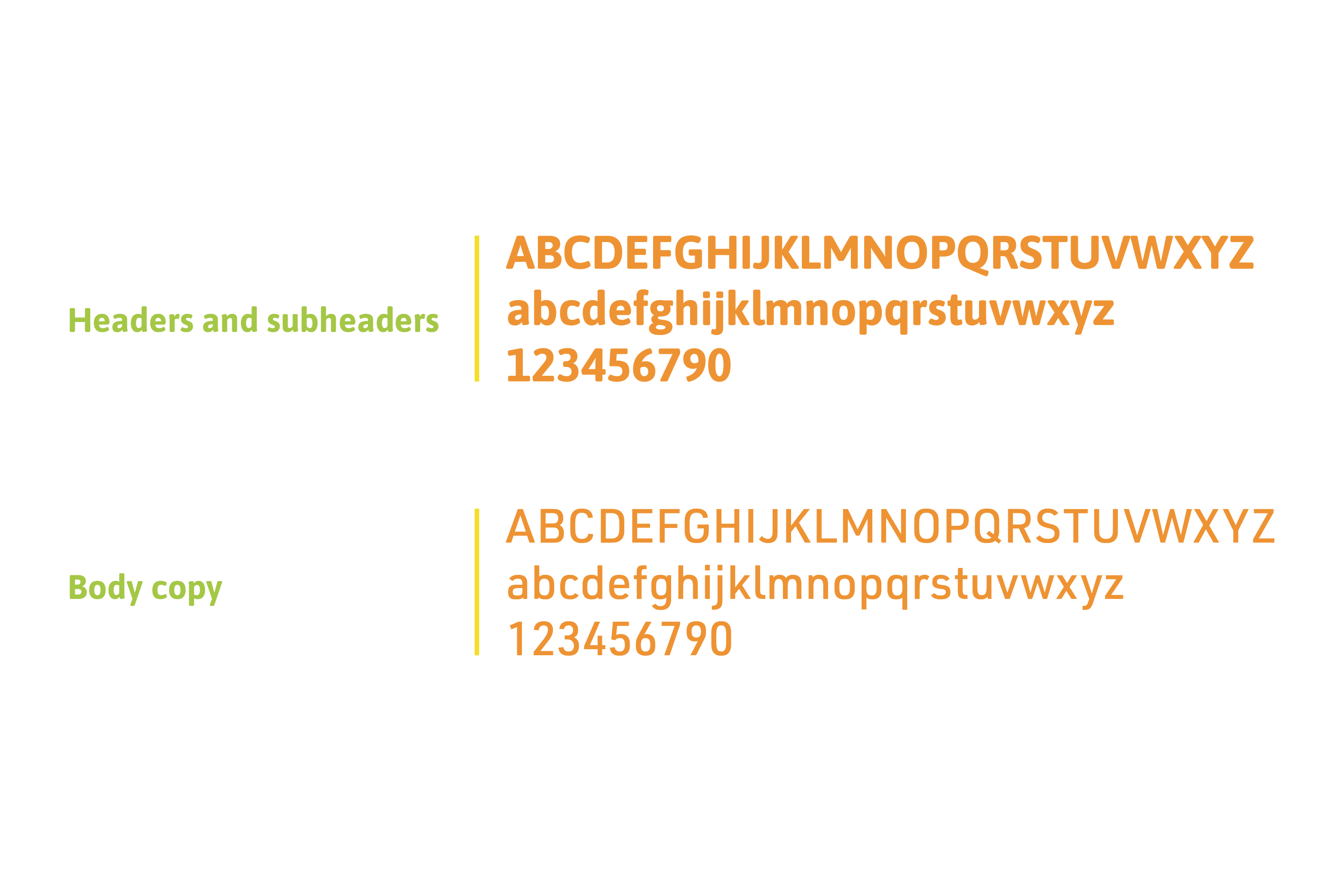
Typography
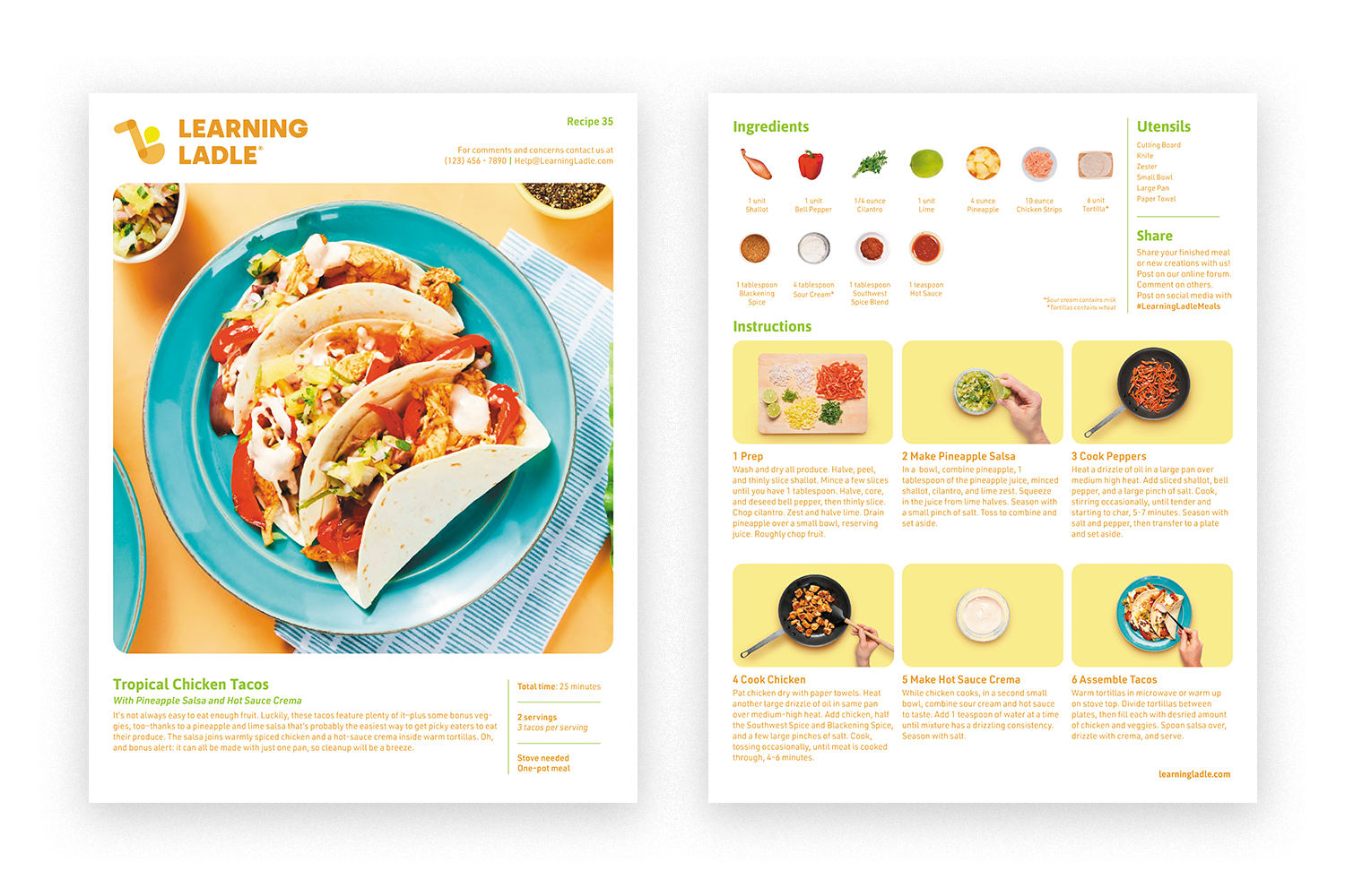
We chose a contemporary geometric
sans serif typeface family for the headers and subheaders. These geometric qualities feel familiar but contemporary as well as friendlier due to their rounded edges. It feels related to our custom logotype but is still an
individual in the system. They are cousins, not siblings.For the body copy, we chose a typeface with tall, attractive letterforms. It feels modern; appropriate for our core customers. It is incredibly legible, making it easy to follow recipe instructions.
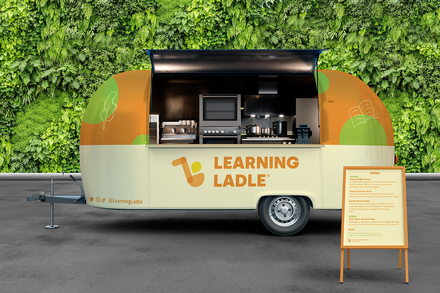
Brand Activations
Food TruckThe Learning Ladle Mobile Kitchen serves as a periodic brand activation appearing on college campuses. Professionals will prepare real Learning Ladle recipes from a curated menu for students to try, and distribute promotional coupons for the service.
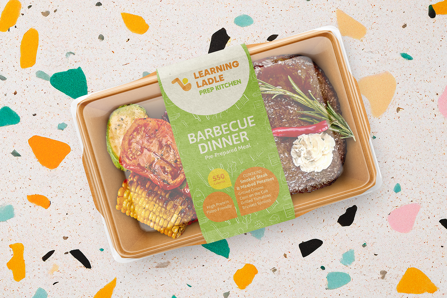
Prep Kitchen
The Learning Ladle Prep Kitchen serves as a space for students to learn how to cook recipes available through guided demonstrations by professionals using recipes available with Learning Ladle.

Packaging
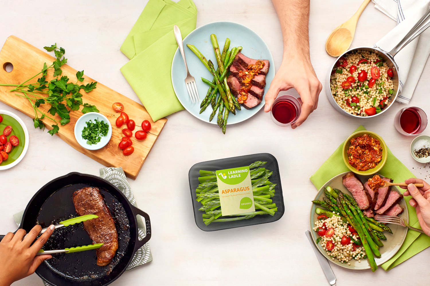
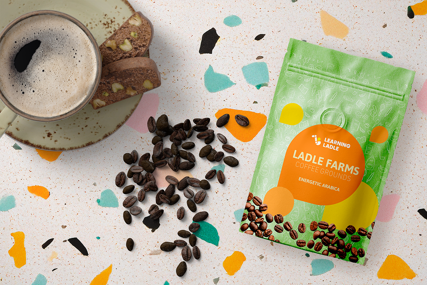
Learning Ladle’s identity system was designed with simultaneous flexibility and uniformity in mind for product packaging. The system needed to be flexible enough to apply to a wide array of pre-packaged meals and ingredients.