Background
The Museum of Pop Culture in Seattle, WA curates and displays subsets of pop culture in elaborate and high-budget exhibitions. Some exhibitions include
posthumous retrospectives of important figures and their life and legacy. Others could feature something currently in the zeitgeist, like a popular video game franchise or a subculture that is gaining traction.
Brief
We were challenged to create a new visual brand identity for the MoPop, and explore potential public-facing and internal branding applications.Creative Direction: Patrick Brennan, Wendy Emery, Tanya Cummings
Art Direction: Patrick Brennan
Motion: Patrick Brennan
Strategy
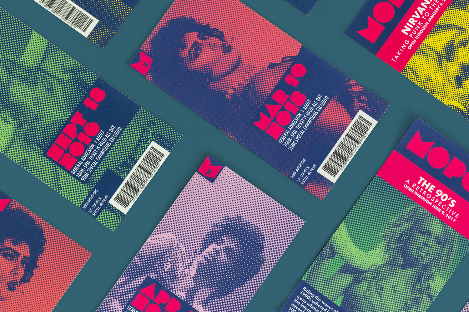
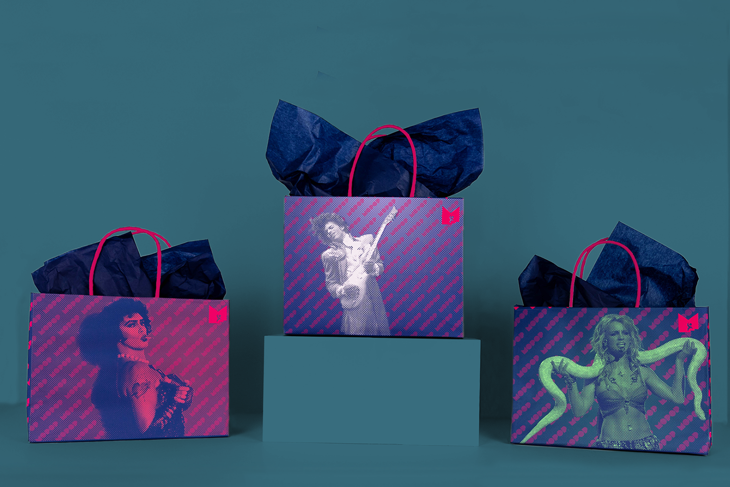
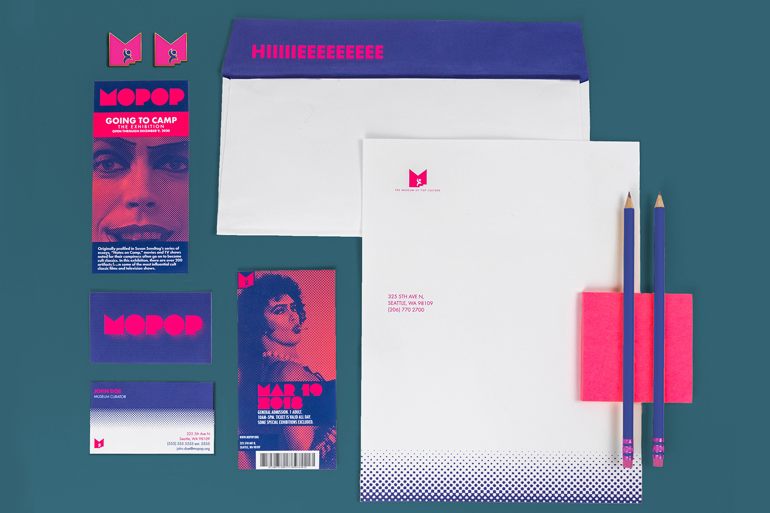
This identity system explores the ways in which the museum is not only an educational resource but also helps shape culture itself through what it chooses to feature. The supporting artwork of the identity references Warhol’s icon portraits and his belief that everyone gets their own 15 minutes of fame. What for, and how impactful that may be, is often questioned at this museum.Branding materials feature artwork supporting ongoing exhibitions. These branding materials are distributed to guests at random. They are then phased out with the exhibitions that they support as they end, becoming collectibles from the museum themselves. The goal is to support repeat visitation with new and exciting branding materials upon each visit.
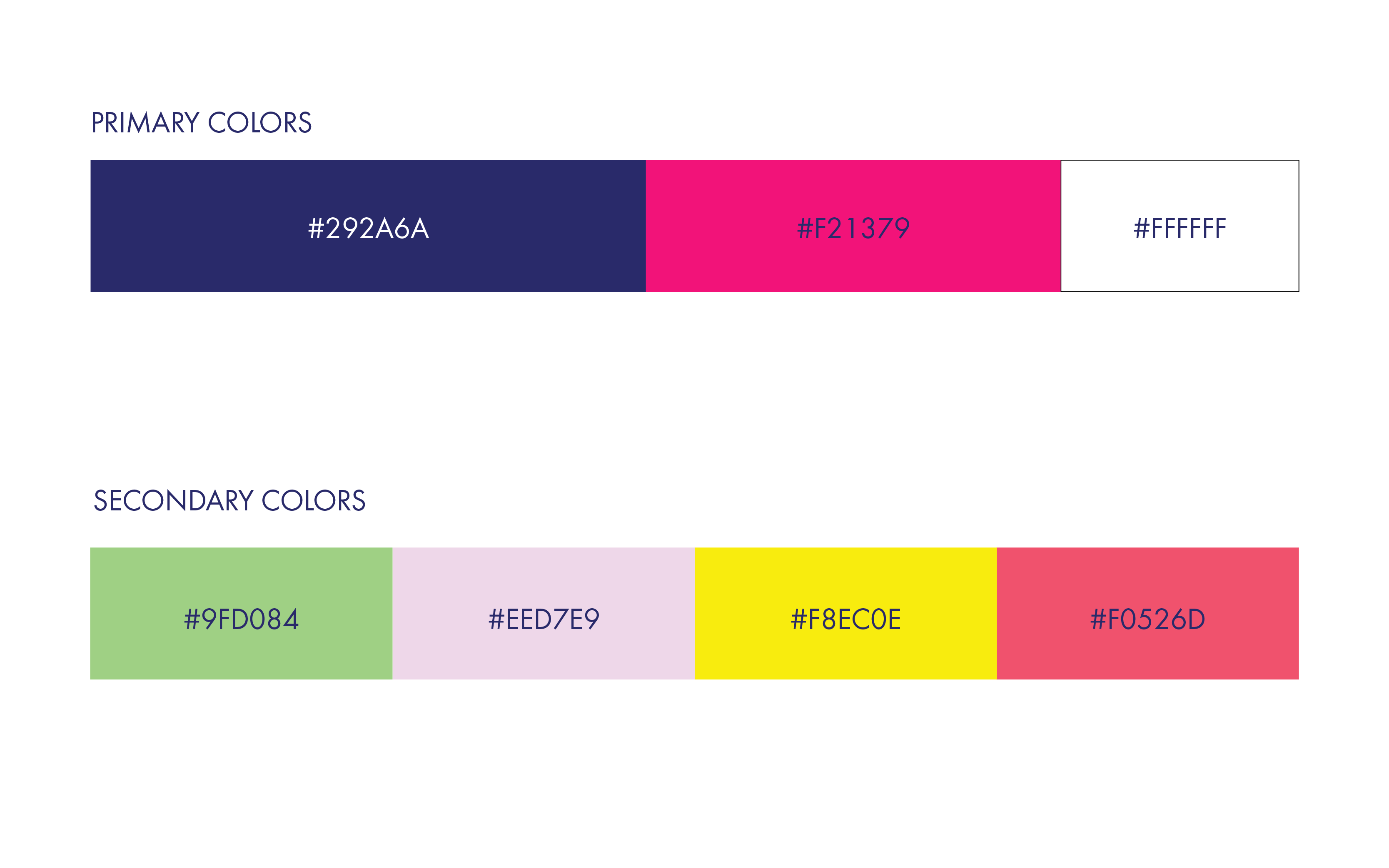
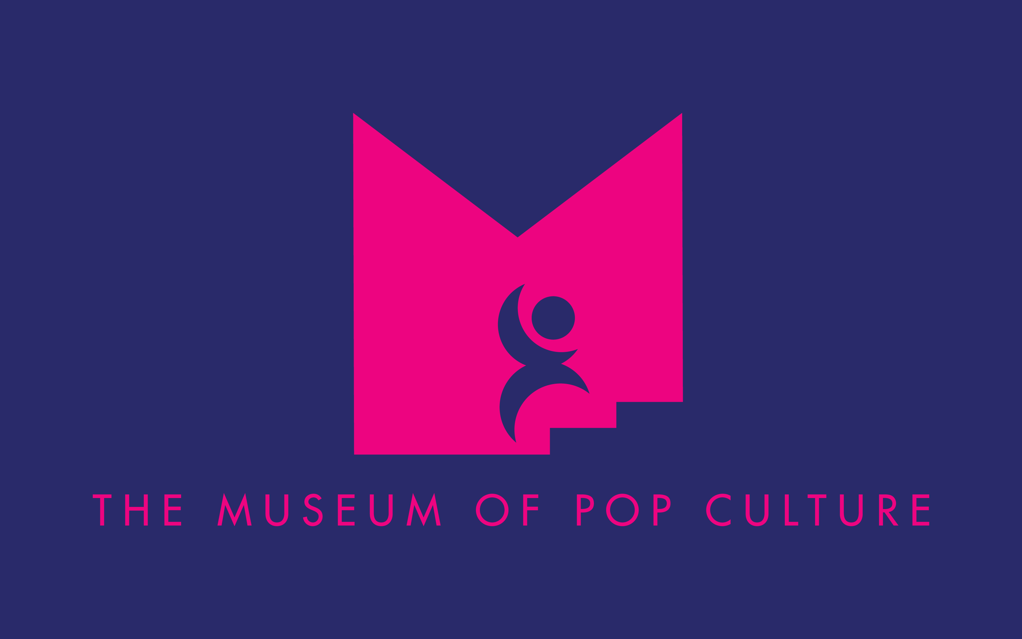
Symbol and Signature
The logo symbol was inspired by the display typeface Lot, which appears to reference the lettering from Milton Glaser’s iconic “Dylan” poster. In the way that Bob Dylan’s Greatest Hits album became a piece of his legacy as a musician, Glaser’s poster became a consumable piece of art and pop culture much like this identity system intends to.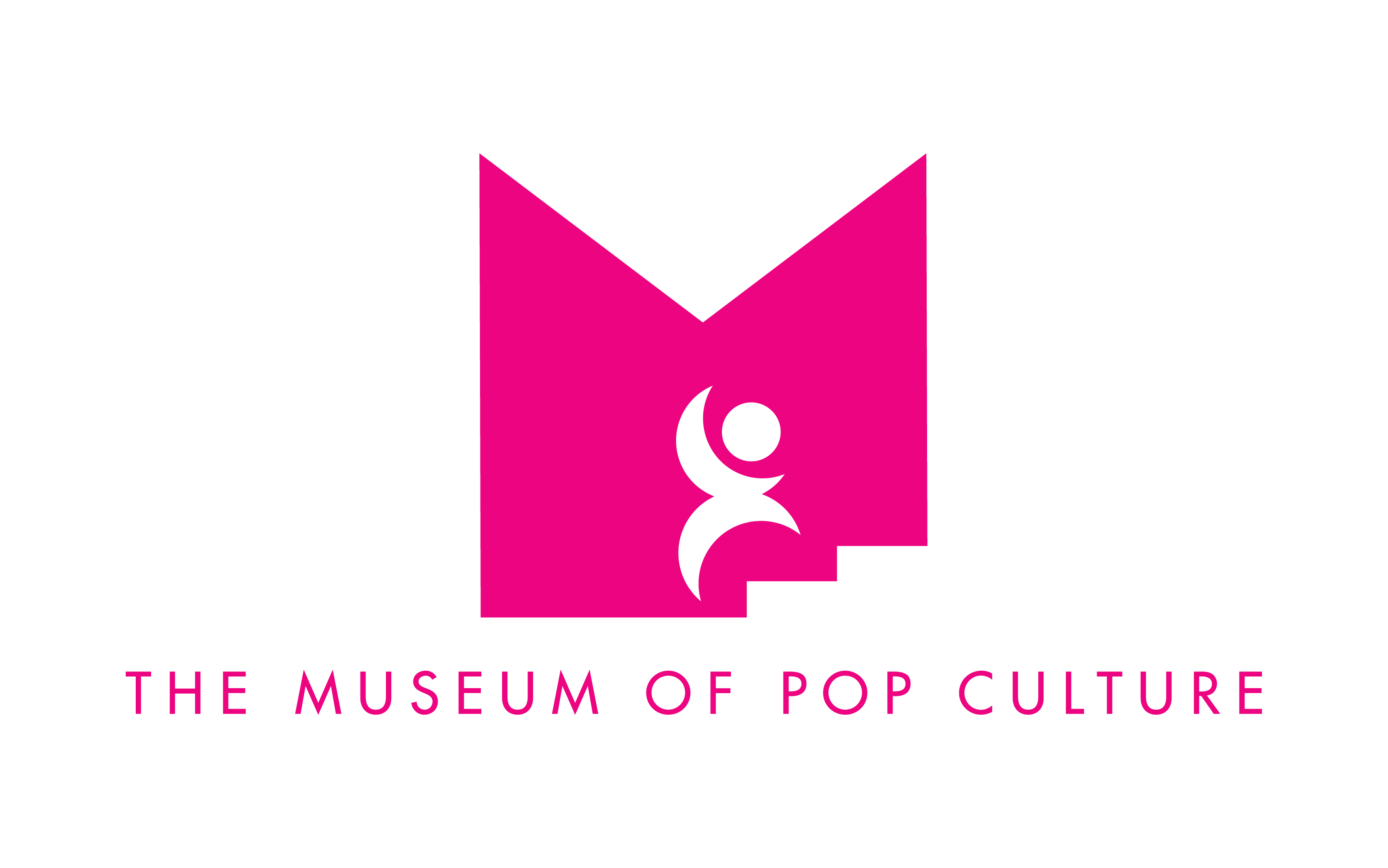

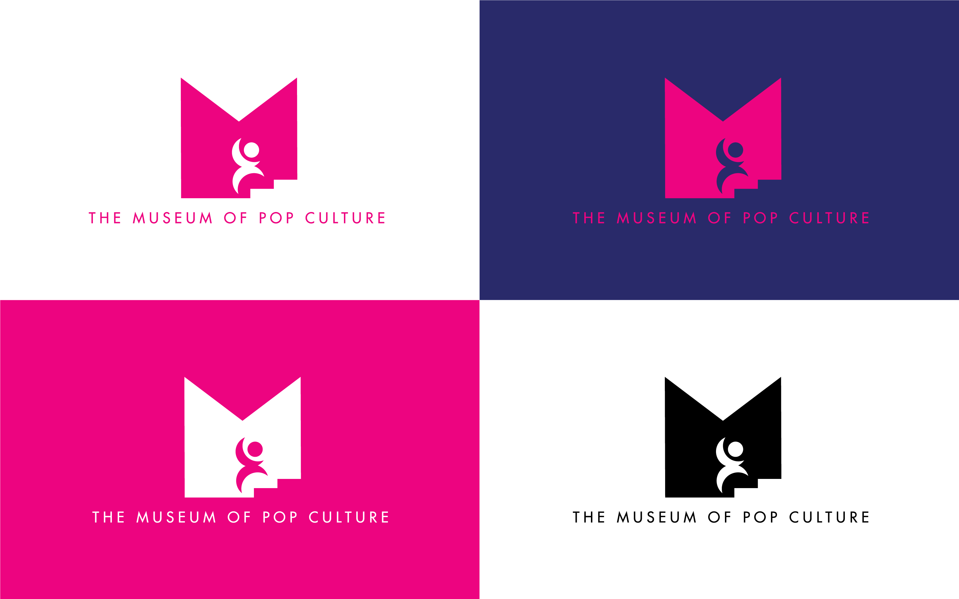
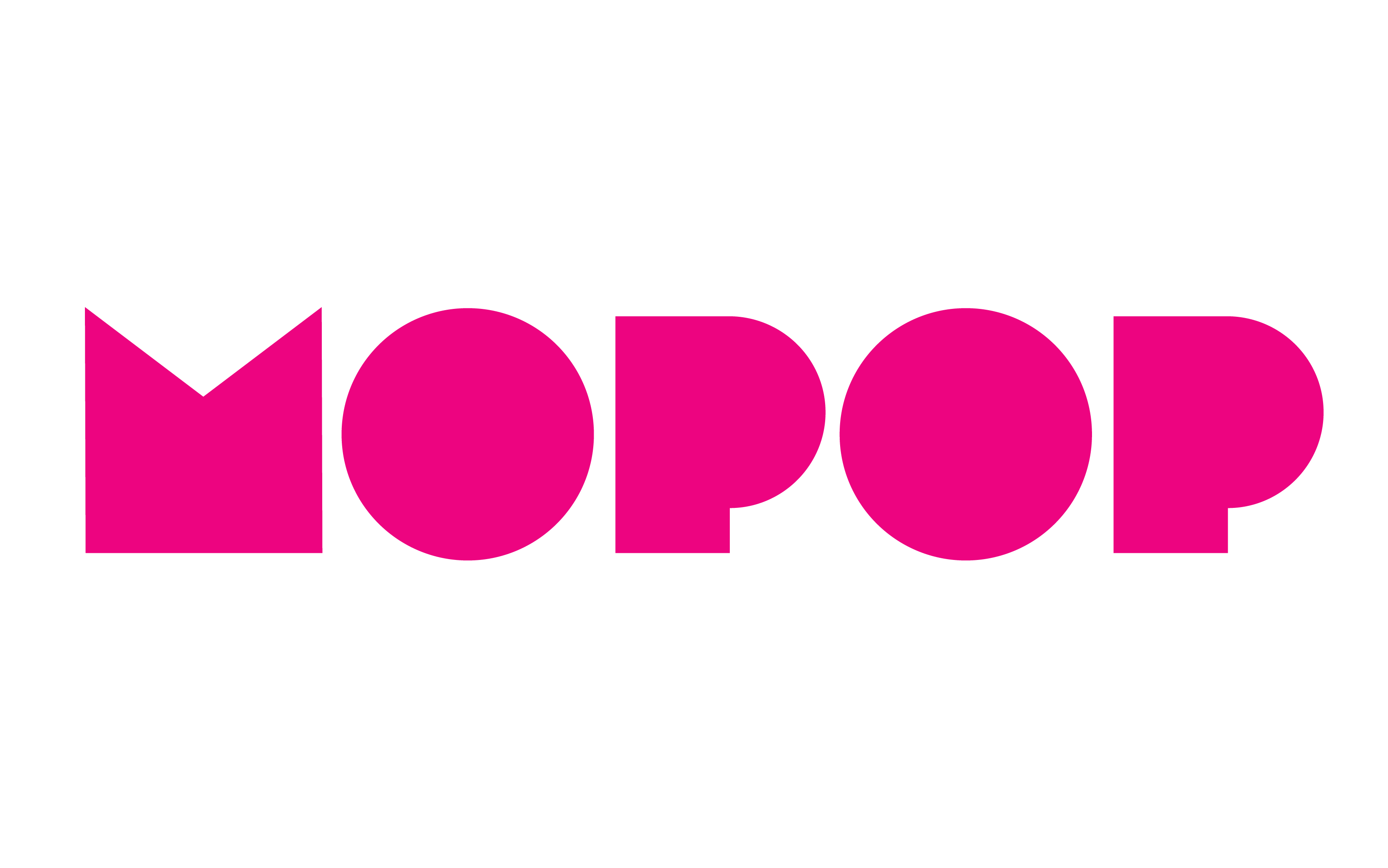
The M from Lot could be viewed as two spotlights pointed at an abstract figure, while a staircase in the corner implies a stage or a symbolic climb to greater fame and influence. Because of this visual association, the M became the basis of the identity and inspired motion applications.
The humanoid figure in the logo is kept abstract and geometric to avoid bias for any industry or subculture, which allows the museum to keep its interests broad. Futura Regular and Futura Extra Bold were chosen as complimentary typefaces to Lot, for their timeless geometric designs and angular capitals (specifically including the M).
The humanoid figure in the logo is kept abstract and geometric to avoid bias for any industry or subculture, which allows the museum to keep its interests broad. Futura Regular and Futura Extra Bold were chosen as complimentary typefaces to Lot, for their timeless geometric designs and angular capitals (specifically including the M).

Typography
Lot is used as a display typeface within the system. Futura Regular and Futura Extra Bold were chosen as complimentary typefaces to Lot, for their timeless geometric designs and angular capitals (specifically including the M).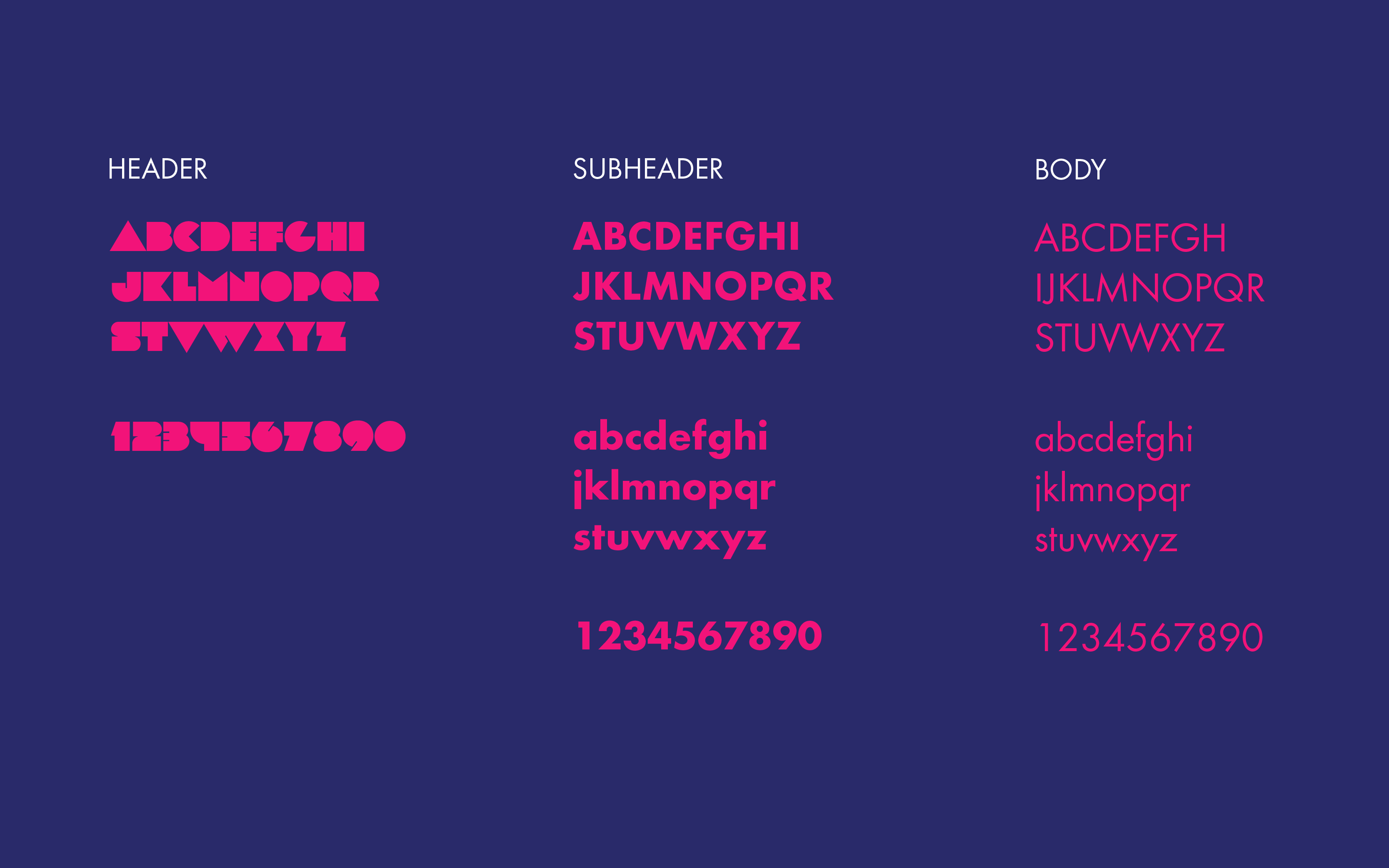
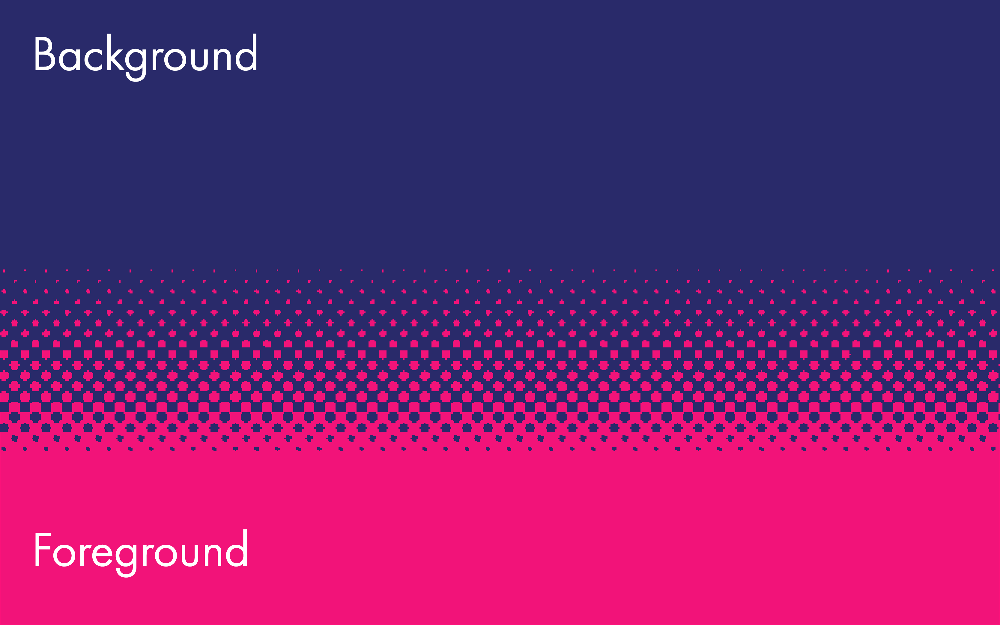
Visual System
The visual system for this brand needed to be flexible enough to feature and respect an array of different types of artwork and talent, and bring them under a uniform look and feel.A screen-printed background and foreground along with photographic imagery supporting the featured exhibitions showcased in a signature secondary color grabs visitors’ attention and directs them to different exhibitions in the museum.